
CUTAD
BRAND CONCEPT
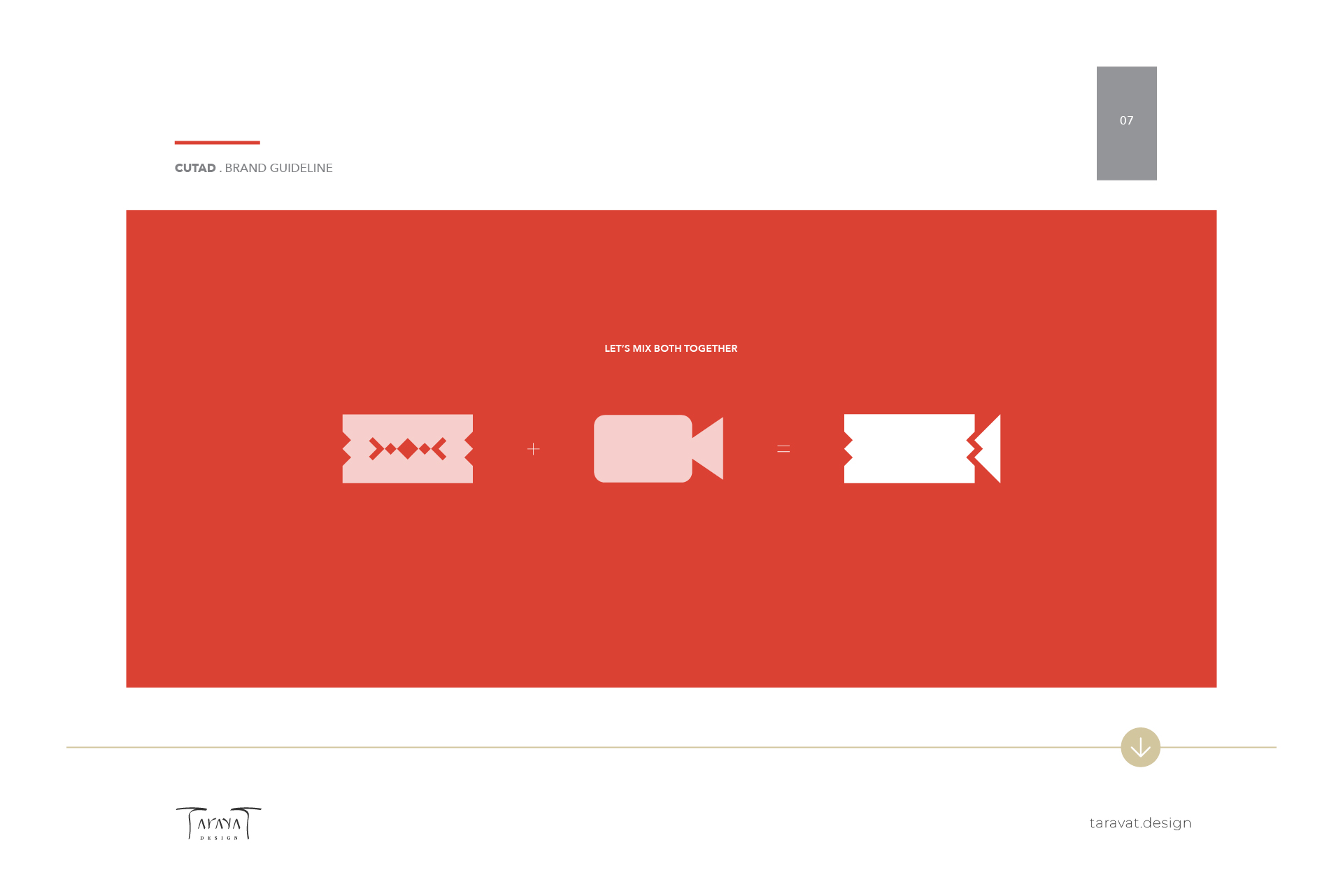
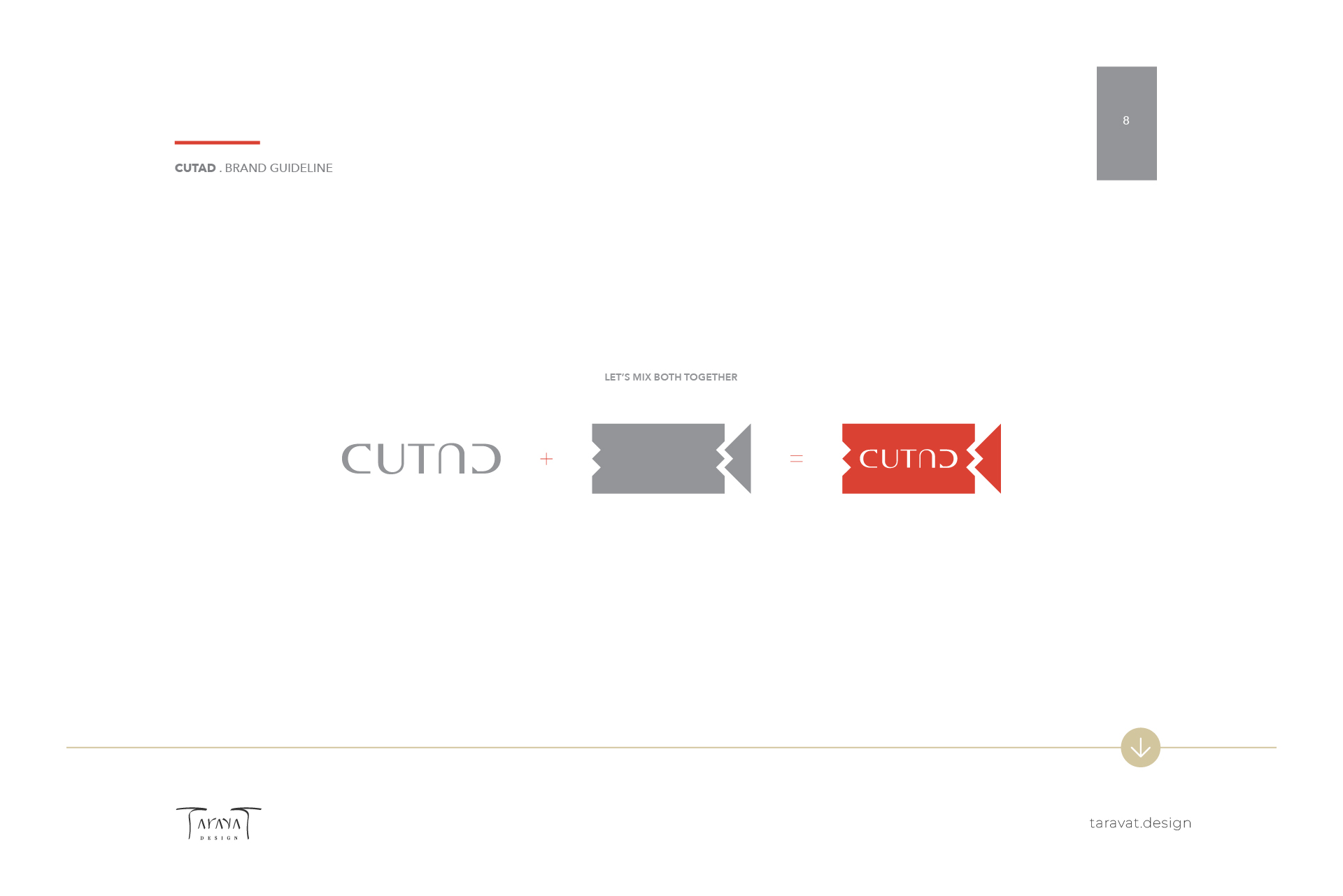
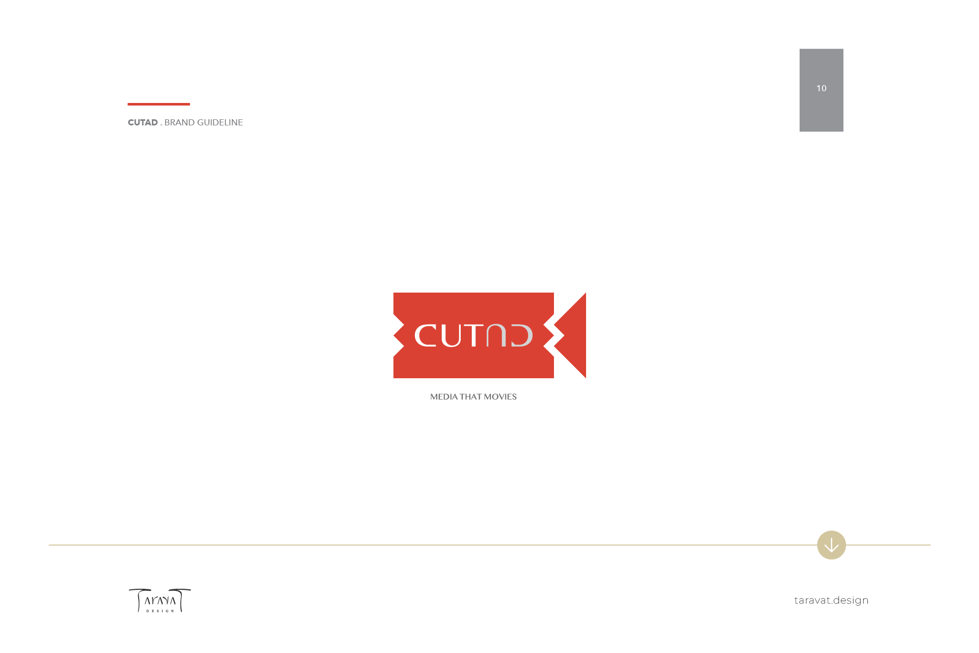
For the logo design of Cutad, I aimed to reflect both the concept of “cut” and “advertising” in a creative and visually striking way. I started with the typography, playing with the symmetry of the words by using a mirrored effect, which not only gives the name a unique and modern appearance but also symbolizes precision and refinement, essential elements in both cutting and advertising. I then incorporated a cut icon from Adobe Premiere, blending it with the shape of a camera frame.
This combination emphasizes the connection to both video editing and visual storytelling, which are key components of advertising. The final result is a cohesive logo that captures the essence of the studio’s work in a visually appealing and professional manner.


WHERE DOES THE LOGO TYPOGRAPHY COME FROM?
The typography plays with the symmetry of the words by using a mirrored effect.
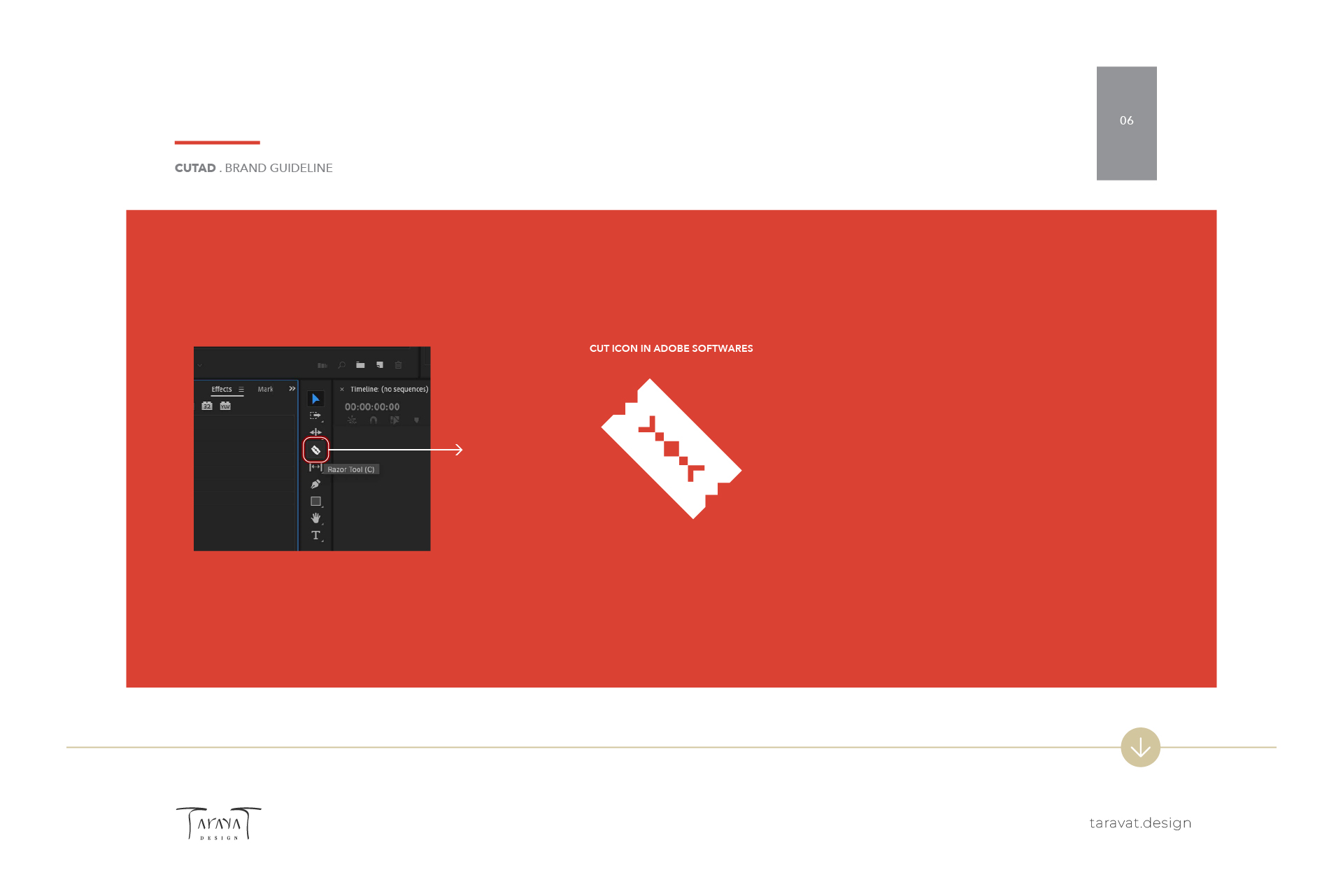
WHERE DOES THE LOGO FRAME COME FROM?
The frame is a cut icon from Adobe Premiere, mixed with a camera icon.
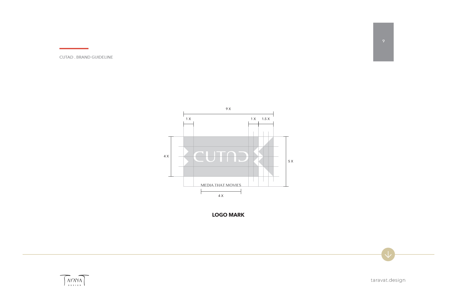

EXCLUSION ZONE
The exclusion zone refers to the area around a logo, specifying the amount of designed clear space (containing no other graphic or text) that can surround
the logo.
Elements that infringe on this space are said to be breaking the brand guidelines.